
Heidi Klum Halloween 2026: Costume Design and Visual Learning
Explore Heidi Klum Halloween 2026 with clear explanations, worked examples, source checks and practical questions for independent student learning.
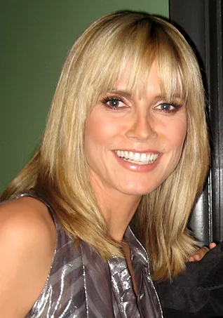
Heidi Klum appeared as an oversized severed-hand character for her Halloween party in New York on 31 October 2026. Dated reporting identifies it as her 25th annual party. The transformation attracted attention, but it also provides a starting point for discussing costume design, scale, visual communication and the difference between a finished appearance and the work behind it.
This guide was checked on 2 November 2026. It gives the brief verified news context without reproducing graphic imagery or claiming backstage access. The practical activities use original paper-based designs, not instructions for copying professional prosthetics, applying unfamiliar products to skin or recreating the event’s costume.
What was Heidi Klum’s 2026 Halloween costume?
The Associated Press and ABC’s dated coverage describe the large hand-themed transformation at the New York event. Keep the year attached to the description. Klum’s earlier costumes regularly appear in search results, and an older image can be mistaken for the latest appearance when its original date is removed.
The article does not claim that the costume was a real injury. It was a performance design. A useful description identifies the intended character or object and the event context without sensationalising physical harm or inventing medical details. The distinction matters when a cropped photograph circulates without a caption.
For a media-reading exercise, compare two fictional captions for an obviously theatrical object. One identifies the event and performance; the other omits them. Ask how the missing context changes the viewer’s interpretation. Accurate captions can prevent confusion without needing a long explanation beneath every image.
Why is a costume also a design problem?
A costume needs to communicate an idea while being used by a person in a particular setting. Appearance, movement, visibility and practical constraints interact. A design that looks convincing in one photograph may require different decisions for walking, sitting or appearing under changing lighting.
This is a general design principle, not a claim about the internal construction of Klum’s costume. This article has not inspected its materials or mechanisms. The finished appearance can motivate questions, but answers about the actual build need attributable production information rather than guesses based on a red-carpet image.
For an original classroom project, choose a harmless theme such as a walking book or a friendly cloud. Write the intended audience, setting and essential visual features before drawing. The brief helps learners explain why they made a choice instead of adding details simply because more decoration seems more impressive.
What is a silhouette, and why does it matter?
A silhouette is the outer shape that remains recognisable when internal detail is removed. In a visual design exercise, it can help test whether the basic idea reads clearly at a distance. This does not mean every successful costume must have an unusual outline, but it offers a useful way to examine communication.
Draw an original object in simple dark shapes on white paper. Ask a partner to identify it before adding texture or colour. If the result is unclear, revise the proportions or outline. The exercise shows that recognition can depend on a few well-chosen relationships rather than a large number of small details.
Then add one distinguishing feature at a time and observe what changes. Keep notes about which addition helps. This is a practical introduction to iteration: a design becomes clearer through testing and revision, not merely through accumulating effects until the page or object feels busy.
How can scale change a familiar object?
An ordinary object can feel different when enlarged or reduced. Scale changes the relationship between the object, the performer and the surrounding space. The visual effect can be playful, surprising or unsettling, depending on the subject and presentation. A designer should identify the intended effect rather than assuming that larger always means better.
For a safe paper exercise, draw a pencil at ordinary scale, then create a clearly labelled enlarged drawing. Compare which features need to remain consistent for the object to be recognised. The project does not need a wearable structure or specialist materials to make the principle visible.
Use a simple scale ratio. If one centimetre in the original drawing becomes three centimetres in the enlarged version, each selected linear measurement triples. Keep the ratio beside the drawing. This connects visual design with mathematics while avoiding the false assumption that every material quantity would also increase only threefold.
Why do proportions matter more than random detail?
Proportion concerns the relationship among parts. A design can contain many realistic textures and still communicate poorly if the important parts have confusing sizes or positions. Conversely, a simplified drawing can be clear because those relationships are consistent.
For an original activity, draw a fictional character with a large head and small body, then draw the same character with different proportions. Ask what changes in the impression, while keeping the name and colours constant. The answers can vary because interpretation involves context, but students should connect their observations to visible choices.
Do not claim that one proportion always produces the same emotion in every culture or audience. Treat the exercise as observation and discussion, not a universal psychological rule. This makes the lesson more thoughtful and avoids turning a design preference into an unsupported scientific fact.
How does colour support the idea?
Colour can help separate parts, establish contrast or connect a design to its setting. It should serve the idea rather than becoming a list of unrelated effects. A designer also needs to consider whether the essential information remains understandable when colour is difficult to distinguish or unavailable.
Create an original paper design in three colours, then view a grayscale version. Ask whether the important parts are still separated by shape, position or value. This is an accessibility exercise, not a requirement to eliminate expressive colour. The goal is to make the main message less dependent on one visual channel.
If you turn the project into a web page, use readable labels and sufficient contrast for instructions. The costume image can be dramatic while the surrounding controls remain clear. Visual excitement is more useful when it helps the audience understand and participate rather than hiding what to do next.
Fashion presentation illustrates design context; not Heidi Klum’s Halloween event or costume.
What can a finished photograph reveal about construction?
A photograph shows the visible result from a particular angle. It generally does not disclose every support, material, joining method or production step. A reader should distinguish “the surface appears textured” from “the team used this exact material.” The second claim requires a source with knowledge of the build.
This is especially important with professional effects work. Do not copy a speculative online materials list and present it as a verified backstage explanation. A costume can combine several techniques, and a short clip may not make their boundaries visible. The article’s educational activities therefore remain original and low-risk rather than imitating an unknown process.
For a classroom exercise, photograph a simple folded-paper object from two angles. Ask a partner to infer how it was made, then show the actual folds. Compare the guesses with the construction. The point is to appreciate how much a final image can leave out.
Why should credit include the wider team?
A public appearance may centre on one performer while depending on many kinds of work. When production credits are available, preserve them accurately. Do not invent a team member’s role or imply that the performer personally completed every technical step simply because their name appears in the headline.
For an original group project, assign design, documentation and presentation tasks. Let one student perform or display the result, then list the actual contributions. This makes collaboration visible and helps learners distinguish a public-facing role from the work needed to produce the object.
Keep the credit proportional and factual. A short source note can identify where a production claim came from without turning the article into repeated promotion for another website. Attribution is about traceability and fair credit, not filling the main text with another publisher’s branding.
How can a simple prototype improve a design?
A prototype tests an idea before the final version is made. For a paper-based classroom activity, that can be a small sketch, a folded mock-up or a sequence of drawings. It should answer a question, such as whether the shape is recognisable or whether a label is readable.
Write the question before making the prototype. Then ask a partner to try interpreting it without your explanation. Their response can show where the design needs revision. A prototype is most useful when the result changes a decision rather than merely confirming that the creator likes their own idea.
This does not require imitating a celebrity budget or production process. A carefully tested small project can teach more than an ambitious imitation that never becomes understandable. The learning value comes from connecting the brief, the design choice, the test and the revision.
Why should movement and comfort be considered separately from appearance?
A performance object interacts with a person and a space. A striking outline can create practical questions about movement or sightlines. This article does not provide engineering instructions for wearable structures. It simply identifies why a photograph of a finished object is not enough to judge every aspect of its use.
For classroom work, keep the activity on paper or in a small non-wearable model. Students can draw a performer’s path on a plan and identify obstacles without building something that restricts movement. This keeps the exercise focused on planning rather than encouraging an unsafe imitation.
In digital design, the parallel is useful: a beautiful screenshot does not establish that a page works when someone interacts with it. Buttons, text and navigation must also be tested. Appearance and usability support each other when neither is assumed from the other alone.
Build a small visual-design notebook
Use fields for idea, intended audience, important shape, colour choices, test question and revision. Add a source field for any reference image and a separate credit for work created by the learner. This prevents inspiration and direct copying from becoming indistinguishable in the project record.
Learners can build a simple digital notebook through our programming courses. Use original drawings or appropriately licensed images. Include alternative text describing the image and a visible explanation of the design goal. The tool should help organise thinking rather than turn every page into an effects demonstration.
Test whether another person can identify the project’s purpose and the latest revision. A record of what changed is useful because it shows learning. It also avoids the impression that a polished final image appeared without planning, feedback or corrections.
How should historical photographs be labelled?
A portrait of Heidi Klum from an earlier event can identify the subject of a profile, but it should not be called the 2026 Halloween appearance. An image of a costume-design process can illustrate the broader concept without depicting her team’s actual work. The caption should make that distinction explicit.
Do not attach an older costume to the current year simply because it is visually dramatic. The year and event belong with the source record. Readers should be able to tell whether an image is a historical portrait, a contextual illustration or direct evidence of the appearance described in the opening.
The useful lesson from the 2026 story is not that every project needs a spectacular transformation. It is that a clear idea, tested proportions, thoughtful presentation and accurate attribution make visual communication stronger. The verified news provides context; the original activities help learners explore the design questions without pretending to reproduce a professional effects production.
A useful final reflection asks what changed between the first sketch and the last paper model. Name one improvement, one remaining limitation and one decision supported by observation. This makes creative progress visible without pretending that a classroom prototype reproduces the professional costume or its production process.
Sources
- Associated Press: 2026 Halloween report, for the dated appearance and party context.
- ABC News: Heidi Klum’s 2026 Halloween costume, for the contemporary visual-reporting context. The paper projects, prototypes and design worksheets above are original educational activities, not backstage claims or instructions for professional prosthetics.
Image credits: cover: Bob Bekian from Thousand Oaks Ca., USA, source, CC BY 2.0. Resized and converted to WebP. inline: Andrew Schutzman, source, CC BY-SA 2.0. Resized and converted to WebP.
Found an error or an outdated detail? Report a correction with the article URL and original source.