
WhatsApp Android Floating Navigation Bar: Beta Rollout Explained
Understand WhatsApp’s floating Android beta navigation, staged availability and the difference between app tabs and system navigation controls.
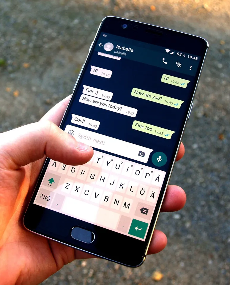
What is changing in WhatsApp's Android navigation?
WhatsApp is testing a floating bottom navigation bar that becomes more compact while a person scrolls and expands again when they move back up. The reported Android beta change is a navigation redesign, rather than a new messaging service. It is reaching selected testers, so installing an update does not guarantee that an account receives it immediately.
The feature report published on 11 November 2026 describes rounded edges, a blurred background beneath the bar and a smaller, icon-led presentation during scrolling. It connects the change with the 2.26.45.5 beta development cycle. These are observations from a staged test, not a promise that every Android phone or the stable app already looks this way.
For someone searching for a “transparent navigation bar,” the important question is which bar they mean. WhatsApp's own tabs and Android's system navigation area belong to different layers of the screen. A design can change inside WhatsApp without changing the phone's back gesture, home action or recent-apps controls.
The two navigation areas people often confuse
An app navigation bar takes you between destinations within the application. Think of moving from a conversation list to another section without leaving WhatsApp. Its appearance is part of the app's interface and may be altered in a beta release. A floating design can leave visible space around its edges, making the content beneath it seem more continuous.
System navigation belongs to Android itself. Depending on a person's settings and phone, the bottom of the display may show a gesture indicator or separate navigation buttons. Those controls help people move between applications or return home. They do not become WhatsApp features simply because the app draws content nearby.
Here is a useful test: if the control still performs the same home or back action in another app, it is probably a system control. If it changes which WhatsApp section is selected, it is probably app navigation. This distinction prevents unnecessary changes to phone settings when someone is actually waiting for a server-controlled app rollout.
Why a scrolling bar can become smaller
A compact navigation component is an attempt to balance two competing needs: access to destinations and space for the material being read. A large bar is easy to recognise, but it occupies part of the screen throughout a long conversation list. A smaller version gives some of that space back without removing navigation entirely.
Consider an ordinary reading task. You open the app, recognise the labelled destinations and begin scanning older entries. Once you are moving through content, the navigation can become less prominent. When you reverse direction, the expanded presentation can help you choose another section. Whether this feels helpful depends on how consistently it behaves and how clearly the selected destination remains visible.
This is a design explanation, not a claim that the new test improves battery life or speeds up messages. A visual change cannot establish either of those outcomes without separate measurements. Likewise, a shrinking component is not automatically more accessible: motion, contrast and the ability to identify an icon all matter.
What the beta report establishes, and what it does not
The reported change concerns a limited Android rollout. It does not establish a universal release date, a complete supported-phone list or a guaranteed setting that turns the feature on. It also does not mean that an iPhone screenshot demonstrates the same implementation on Android. Similar-looking designs can be developed separately on different operating systems.
Treat a version number as one piece of context. Two people may have the same installed version and still see different interfaces because a company can enable an experiment for only part of its audience. That difference alone is not evidence that one phone is broken, that an account is banned or that an update failed.
A careful description should therefore include four things: the platform, the version being discussed, whether the account is in a beta programme and the observation date. Without those details, a screenshot shared in a group can appear to contradict another screenshot even when both are genuine.
A sensible way to check your own installation
Begin with the official app listing and check whether an update is available for the installation you already use. Read the app name and developer identity carefully. A search result offering a “transparent WhatsApp unlock” is not equivalent to an official update, even if its thumbnail resembles a familiar messaging icon.
Next, open the app and observe its normal behaviour. Scroll a list in both directions and note whether the navigation changes size. Record what you see rather than trying to reproduce a viral demonstration by deleting files or repeatedly reinstalling the application. Reinstallation can introduce unrelated account and backup complications without granting access to an experiment.
If the design is absent, the most accurate conclusion is simply that it is not available on that installation at that moment. Waiting for an ordinary official update is more proportionate than treating a missing cosmetic change as an emergency. Essential messaging and account security should take priority over matching somebody else's screenshot.
Should you join the Android beta programme?
Google Play distinguishes beta versions of existing applications from unreleased early-access apps. Its guidance explains that experimental versions can be less stable and that some programmes have limited places. Those are practical considerations for anyone whose phone is also their main channel for work, family or study communication.
Before joining a beta, ask what you want to learn and what disruption you can tolerate. A student interested in interface design might reasonably document an experiment on a suitable device. A person coordinating an important examination group may prefer the ordinary release channel. Neither choice needs to be justified by a promise of getting the floating bar immediately.
Do not interpret a full beta programme as a reason to pay a stranger for admission. Nor should a person provide verification codes or account access to someone offering to activate a design. Access to an interface experiment is not worth surrendering control of a messaging account.
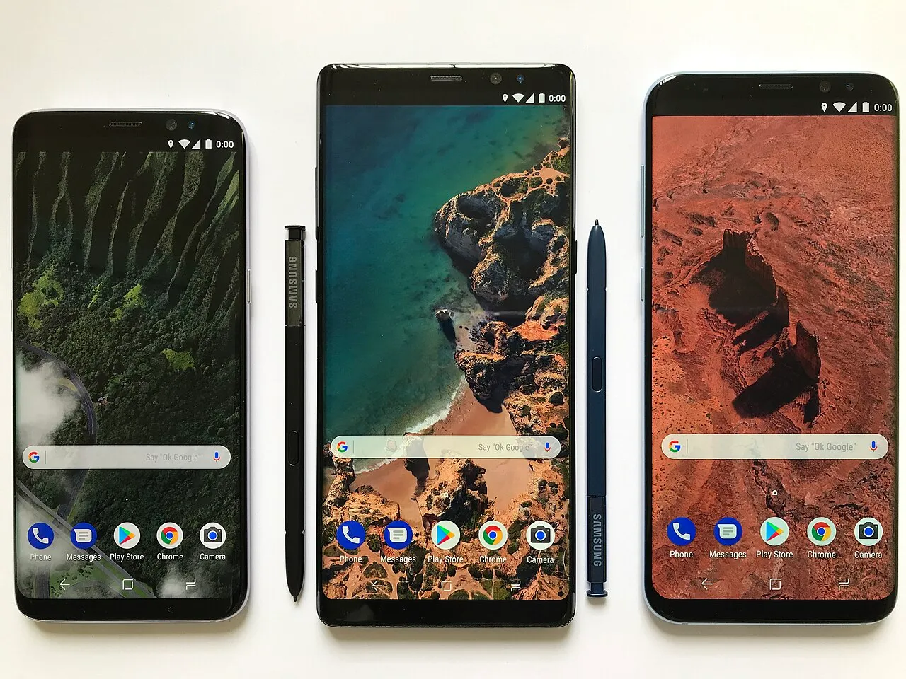
Archive Android devices illustrating platform context, not a demonstration of the new WhatsApp test.
How to compare the design fairly
If you are evaluating the change, choose a small set of repeatable tasks. For example: identify the current section, move to another destination, return to the original section and read several entries without accidentally changing tabs. Repeat the tasks with the bar expanded and compact, noting any confusion instead of judging only the appearance.
Keep comparisons on the same phone when possible. Screen size, display scaling and brightness can all affect how much space an interface seems to use. A cropped screenshot from a larger device is a poor basis for deciding whether a design is more comfortable on a smaller handset.
A useful observation sheet can contain columns for task, expected action, actual action and difficulty. “The selected icon was hard to recognise against a bright background” is more informative than “the update is bad.” Specific feedback gives a developer something to investigate and helps other users decide whether they face the same problem.
Transparency, blur and readability
Transparency allows something behind a surface to remain visible. Blur changes how much detail from that background can be recognised. A design can use both, but the terms are not interchangeable. A blurred panel may still be substantially opaque, while an unblurred transparent panel can leave text and icons competing with busy content.
Readability depends on the combination. Imagine a dark icon over a pale conversation background, then imagine the same icon over a colourful image. A component that works in the first situation can become difficult to distinguish in the second. This is why a pleasing promotional screenshot cannot settle every usability question.
When checking a new interface, look at ordinary conditions: light and dark appearance, larger text, a busy list and a short list. There is no need to alter security settings or install graphic modifications to perform that basic observation. The aim is to understand the actual released behaviour, rather than constructing a demonstration that hides its limitations.
What Android's edge-to-edge documentation explains
Android's developer documentation describes how application content can extend behind system bars and why developers must account for screen areas reserved for controls and gestures. It discusses insets, which help keep tappable content from being obscured. This provides technical background for modern full-screen layouts, but it is not documentation of WhatsApp's private implementation.
For readers, the practical point is simple: seeing content near the bottom edge is not enough to prove that a control has disappeared. An app may draw behind a system area while still needing to keep important touch targets clear. A good layout must remain usable when the person switches navigation modes or changes display settings.
If a control becomes difficult to tap, describe the symptom precisely. Mention the phone model, Android version, app version and navigation mode in feedback. Avoid posting private conversation screenshots publicly. A cropped, redacted example that shows only the layout problem can communicate the issue without exposing another person's messages.
Common mistakes to avoid
One mistake is treating a beta observation as an official deadline. Another is assuming that every visual difference comes from the same feature. A theme, display setting, platform variation or older screenshot can change the appearance without revealing anything about the latest Android test. Check the surrounding context before offering instructions to someone else.
Another mistake is confusing unofficial modified applications with legitimate experimental builds. A familiar name in a download page is not proof that its package is maintained by the original developer. This article does not recommend third-party APKs, modified clients or tools that claim to force hidden features.
Finally, avoid clearing an account or disabling protections just to chase a cosmetic change. If the app works normally, missing a staged redesign is not by itself a fault requiring repair. If messaging genuinely stops working, troubleshoot that functional problem separately rather than assuming the navigation experiment caused it.
Questions Android users are asking
Is the floating bar available to everyone?
The report describes selected Android beta testers. Universal availability is not established. Your account may continue to show the existing interface even after an official update. That is consistent with a staged test and does not demonstrate a problem with your phone or require an unofficial download.
Does this remove Android's navigation buttons?
No such conclusion follows from the reported app redesign. WhatsApp's own destinations and Android's system navigation are different components. Check which control you are looking at before changing phone settings. A compact app bar does not by itself replace the operating system's back, home or recent-apps behaviour.
Can a setting force the new appearance?
No verified universal activation setting is established in the source reviewed for this guide. Be cautious about instructions that promise otherwise, particularly if they request codes, account access or software from outside official distribution channels. An account-specific rollout cannot safely be treated as a missing switch.
Does a new navigation bar change privacy?
A cosmetic redesign alone does not demonstrate a change to message encryption, account permissions or data handling. Those questions require their own documentation. Evaluate the interface for usability and consult the official privacy information separately instead of assuming that a transparent-looking surface reveals how information is protected.
A short checklist before sharing the news
Before forwarding an update claim, check that it identifies Android rather than iOS, distinguishes beta from stable availability and does not promise a release date absent from its source. If it shows a screenshot, check whether the image demonstrates the app bar or merely the phone's system navigation area.
When helping another person, start with their question. If they only want to know why their screen looks different, explain staged availability rather than giving a long sequence of unnecessary device changes. If they are evaluating accessibility, focus on readable labels, contrast and reliable touch targets. Different needs deserve different answers.
For more technology explanations and other current guides, browse the RayTech updates collection. The useful takeaway from this test is a clearer understanding of how app navigation, operating-system controls and experimental rollouts fit together. The appearance may continue to evolve; the distinction between those layers remains valuable.
Sources
- Source: Android bottom-navigation beta report
- Source: Android edge-to-edge documentation
- Source: Google Play beta-programme guidance
Image credits: cover: Santeri Viinamäki, source, CC BY-SA 4.0. Resized and converted to WebP. inline: Android Open Source project, source, CC BY 2.5. Resized and converted to WebP.
Found an error or an outdated detail? Report a correction with the article URL and original source.